BI Beat - Good Forms Build Better Systems
Five Web Form Design Practices Unemployment Insurance Systems Should Prioritize
The BI Beat is a monthly newsletter column written by the Behavioral Insights team, featuring insights, practical examples and interviews from the field. Provided in partnership with the U.S. Department of Labor.
Picture yourself trying to schedule a doctor’s appointment online. It sounds simple enough. Pick a provider, choose a date, fill out a few forms, and then done.
But the page asks for information you don’t understand. The required fields seem endless. Error messages appeared without explanation. The process takes too long, so you eventually just give up.
That experience captures something important about web-based forms: people rarely stop because they do not want to complete the task. More often, they stop because the process becomes mentally exhausting, they run out of time and forget, or delay in getting back to the task.
Forms in Unemployment Insurance
Form design is especially important in unemployment insurance (UI) systems, where people are often already under stress when interacting with online applications, certifications, and reporting requirements. A confusing or overwhelming form does more than frustrate users during moments of scarcity and cognitive overload: it can increase errors, delay benefits, reduce compliance, and weaken trust in the system itself.
Unclear instructions, unnecessary questions, or confusing navigation can dramatically reduce completion and accuracy rates. This is where good web-form design becomes essential.
1. Keep forms as short as possible - or at least as manageable as possible
Unnecessary fields increase inaccuracies or abandonment (i.e., a user leaves a form before completing it) because every additional question adds mental effort (CXL). At the same time, unemployment insurance systems face a real challenge: forms often need to collect large amounts of information to determine eligibility, prevent fraud, and support proper adjudication.
That means the solution is not always to make UI forms shorter. It is to make them feel more manageable, balancing program integrity with user experience. Behavioral science shows that people are more likely to complete difficult tasks when they are broken into smaller, structured steps.
Agencies can reduce friction without sacrificing integrity by:
- Using conditional logic to only show relevant questions
- Breaking forms into clear sections
- Explaining why information is needed
- Allowing users to save progress and return later
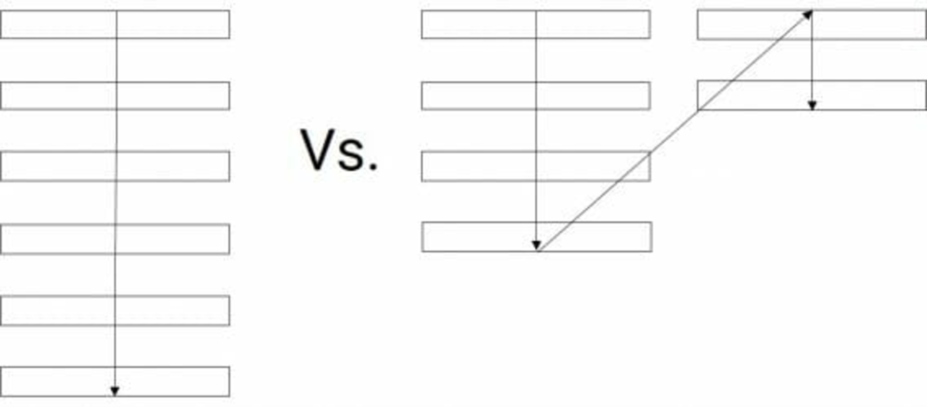
2. Use single-column layouts
Users complete forms more quickly and accurately when forms follow a single-column layout. Multi-column layouts force users to pause and decide where to look next. Single-column forms create a smoother experience because users naturally move from top to bottom without interruption. This becomes even more important for UI claimants completing forms on mobile devices.
Good UI forms should:
- Present one clear path forward
- Avoid cluttered layouts
- Use spacing to separate sections clearly
3. Place labels above fields and use plain language
Industry research shows that labels placed above form fields improve readability and scanning (CXL) (DesignLab). But placement alone is not enough. Language matters too. Many UI forms rely heavily on technical terminology that increases confusion and mental strain.
For example:
Instead of: "Provide documentation regarding remuneration."
Use: "Upload proof of income."
Good labels should:
- Use conversational language
- Stay visible while users type
- Clearly explain what information is needed
4. Design error messages that help people recover quickly.
Few experiences are more frustrating than submitting a form and receiving: “Invalid entry.” Well-designed forms help users recover quickly by explaining the issue clearly and offering immediate solutions. Jakob Nielsen’s usability heuristics emphasize that interfaces should help users “recognize, diagnose, and recover from errors.”
For example:
Instead of: "Error" at the top of the page
Use: "Your Social Security Number must contain 9 digits" next to the SSN field.
Even better, forms should use real-time validation whenever possible so users can fix mistakes immediately instead of waiting until the end.
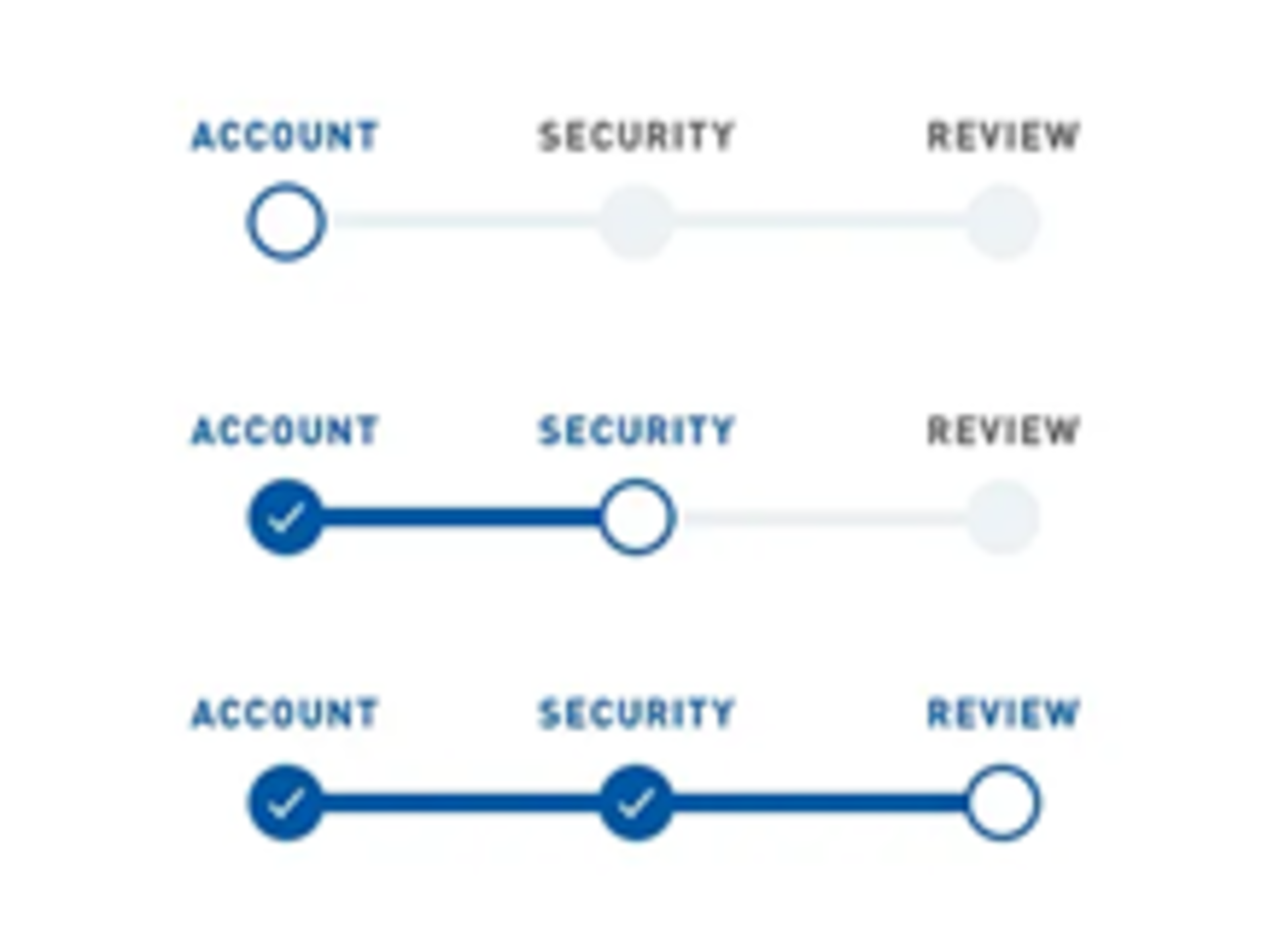
5. Show progress and reduce uncertainty
One reason people abandon forms is because they do not know how much work remains. Code for America emphasizes that users should feel oriented when completing government forms. (Code for America). Progress indicators help users understand:
- Where they are
- How many steps remain
- What information comes next
This creates a sense of momentum and makes large tasks feel more manageable. People are more likely to complete forms when they can see the finish line.
Good form design is behavioral design
When people struggle with unemployment insurance forms, it is easy to conclude user error – the user abandoned the application, entered inaccurate information, or missed a deadline.
Behavioral science instead asks a pragmatic question: Could the form itself help people avoid those errors? Thoughtfully designed forms reduce friction, lower cognitive burden, guide attention, and build trust. And in unemployment insurance systems, those design choices can be the difference between an accurate filing and an improper payment.
Work With Us
Our BI unit works with states interested in designing better forms to improve claimant experience and program integrity. Email integrity@naswa.org to learn more.

The Behavioral Insights (BI) team applies behavioral science to help solve complex challenges facing the workforce system. By understanding how people make decisions, we can help improve compliance, reduce improper payments and streamline processes.
*A NASWA member login is required to access some Library resources. Watch this video for help.
This project is funded by the U.S. Department of Labor and administered by NASWA.